I checked out this site recently, http://www.we-make-money-not-art.com/, and found out it's a blog created by young people like ourselves exploring the world around us through art, architecture, engineering, and design to show different aspects of it throught their eyes. As well as to show their interpretations of things and show sides of art one would not normally see unless looking for it. I particularly liked the site and Post Patman caught my eye enough to read it and I found it to be rather interesting and humorous. It was about an art collection made completely out of food that was rotting. The design and artist were very unique and I probably wouldn't of have learned about him otherwise without reading from this site because quite frankly it wouldn't of have occured to me to look for rotting food design. Granted, it does make for interesting conversation.
The website itself has a neat design with a good balance of color and white to look almost like if I was reading a pop magazine. The upside to the site is it's free and doesn't have that much advertising that it becomes a neusance or hinderance to have a billion pop ups to get to an article which can and does become very annoying as one might expect.
I could see myself reading the blog again because I'd like to see the aspects of what goes on in the world around me in an unconventional way and through the eyes of those in my generation. I honestly don't particularly care for the title but I guess everyone's got to make a living depending if you take it on a literal or abstract sense from an artist free-soul point of view it's rather crude. On the bright side is they don't make you pay for the site and are basically providing you information without charging you a cent which makes the name ever further intriguing. I wonder why they picked it exactly. Besides that, the blog links to other interesting blogs that are architectural and of other backgrounds. The only thing I would watch out for is the blogs of which I am clicking on as some with titles looked too unconventional on the point of being adult oriented. Besides that, the site is great and I will continue to read up on it every now and again as it makes the reader want to read for the sake of reading and learning and not a forced dread.
Wednesday, February 28, 2007
Top Mod
Top Mod Screen Shot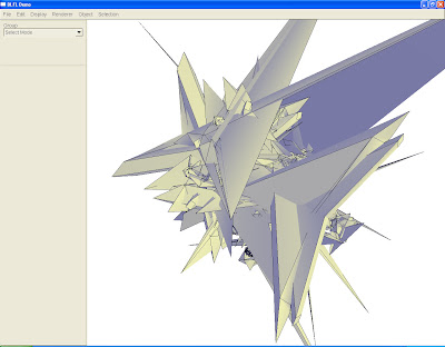

Rendered Final Image 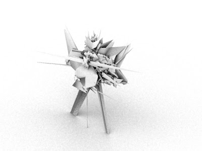

=)
The TopMod program is designed to be similar to the basic concepts of Google Sketchup but is redesigned as an academic program to create visualizations using a combinatation of that program and Autodesk Viz for rendering. The TopMod design I created is shown above and was designed many through experimentation of several of the applications. Those applications including handle with a 5 twist and thickness, cube extrusion changing the scale, delete edge for cleanup, octahexedral extrusion, icohedraxal extrusion, remeshing of conversion and preservation, rind modeling, and hiding the wireframe. The form was then saved as an .obj and exported to Autodesk Viz. There it was rendered and used Using Ambient Occlusion to enhance render details. Thus further making the form look realistic. According to Everflow.com the explanation for Ambient Occlusion is as follows:
"There are many uses for the Ambient Occlusion shader, one being to accentuate details/edges and increase the realism of 3d renders. This occlusion is also known as the 'dirtpass' or 'dirtmap'. The pass renders quite quickly and since it is a Global Illumination (GI) solution, it is an excellent tool when time is of the essence, and GI quality is required.
I will not go into the details of the science behind the magic, simply put; ambient occlusion fires rays into the scene at various angles from various points on the geometry, and determines which rays are blocked by other geometry, and creates a visual representation of the occlusion. The closer the occlusion, the stronger the representation."
I will not go into the details of the science behind the magic, simply put; ambient occlusion fires rays into the scene at various angles from various points on the geometry, and determines which rays are blocked by other geometry, and creates a visual representation of the occlusion. The closer the occlusion, the stronger the representation."
Basically, it is complex geometry takes the different angles of the form to make the angles highly defined and give the illusion of being realistic.
The program Autodesk Viz is a very unique program that has many applications and can be overwhelming. Through use of tutorials it is possible to go step by step to get a glimpse of what the program can do and see for yourself what Ambient Occlusion is. Autodesk is a great program that does give a realistic look and using a white background looks similar to a very clean pencil shaded drawing. The forms look clean cut and have depth. With further skills and knowledge it is possible to render to the point of attaining that realism. If you click on the link below there are tutorials provided and websites that show this concept. The final image of my rendered form is shown at the top of the blog post.
Links:
Tutorial for Top Mod
Extension needed for Autodesk Viz used in tutorial
Everflow explanation and examples
Monday, February 26, 2007
Wednesday, February 21, 2007
ReMix
Combinformation is a program that allows user to search items using several different browsers and compose the links through pictures and words into a compositional piece. This website can be found at:
http://ecologylab.cs.tamu.edu
Upon entering the program you have to first learn how to use it. There are helpful tips and a learn-how to link. The program is relatively easy to use the only real downside are two main ones: when you're re-arranging the pictures they are hyperlinked so you open several links all at once basically so that further delays it while those pages upload the program is still taking a rather delayed time to upload the other websites. Saving was also an issue since it takes a while, but granted it is not hard. It works similar to the program Powerpoint with those functions of cut--delete, undo--control z, and rearranging/resizing pictures. The pictures also appear as transparent and can and do overlap. Text can also be changed to have a proportion to the pictures and you can change how fast or slow you want the images to appear. Logically, you would think quicker but that is not true due to as you're trying to rearranged a couple new ones have already popped up and will overlap your current picture. That is why you have to press the stop and play key as necessary to get more links.
The way I designed mine was my searching for three important topics: green architecture, sustainability, and modular architecture. These are all very important topics in today's society and something I feel strongly about. I then ran the search engine using google to find images and text. I cut out the text as I wanted the composition to be seen as a whole first and then as individual pictures and links. Besides when you scroll over the picture the text of what the site is and the link is listed. I did not put the pictures in an order in regards to those topics as I had originally thought to do because I wanted to peak the interest of the viewer to look through the different links especially since the three topics are related. I went through and then looked at which websites were more or less relevant and deleted those whose link did not correspond. I also deleted or cut out the pictures that did not fit the composition. I seperated the pictures in order to make sure that they did overlap to a point to show a collage but still be able to see most of the picture. I did change the sizes and tried to contrast the grey with the colored photos. I wanted to have it be as orderly as possible while still keeping the look and feel of a collage but not the point of overwhelming the viewer or making them go through the trouble of finding the links for themselves. I also added text and changed the colors and text emphasizing the three topics. If you would like to see my design the link is as follows:
http://xavier.tamu.edu/students/ebs4031/web/cf/remix.html
http://xavier.tamu.edu/students/ebs4031/web/cf/remix.jpg
http://xavier.tamu.edu/students/ebs4031/web/cf/remix.xml
http://xavier.tamu.edu/students/ebs4031/web/cf/remix_thumbnail.jpg
Monday, February 19, 2007
Typography Page Layout
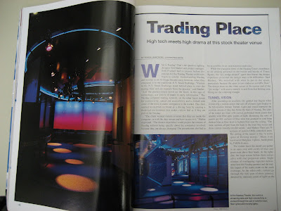
The article was taken from Architectural Lighting from the TRC located in Langford Building A at Texas A and M College Station. The articled was about how a computer company in order to gain confidence in their customers and try show the workings behind how their computers work. They used the space with different lighting effects to create to try and get across the point in an entertaining but educational way.
In regards to the layout of the article I do like how there is an interesting picture in the left hand corner that is introduced before the actual article. It peaks the interest of the viewer to read further, but it doesn't overwhelm the reader by several means. Visually, there is not a lot to read but the content is there. The borders help to define the edges and focus in on what is important. That way the viewer's eyes don't wander all over the page. The title is clean cut like the subject matter, bolded to grab attention, and incorporates the theme by having the background of the space be incorporated in the lettering. There is a smaller subtitles that do not distract but are emphasized as is their purpose. The letter cap with the "W" makes the opening sentence interesting and visually takes away just how much there is to read which isn't overwhelming. The picture on the bottom left helps to add to the design but doesn't take away from the article because the text wraps around it with an undefined line border. Visually, your eyes make a box around it to know it's not part of the text but is important to the text. You don't necessarily have to read it but since it's bolded and out of context you want to find out what the picture is about. There is also a fairly neat organization with the two columns and spacing between them and the paragraphs. The ideas are broken apart from each other and the titles are emphasized but not the point of being too distracting from the overall reading.
Finally, the colors tie together the whole work so that it is thoughtful in how it's laid out, visually pleasing, and well composed.
Thursday, February 15, 2007
Wednesday, February 14, 2007
Menu Revised part 2
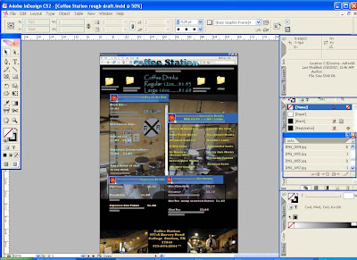
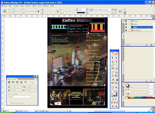
I continued the project proposal as before and expanded upon it. I changed the texts and colors to identify the different categories. I made the lists show up as different IM boxes so that the menu looks like a computer monitor screen. I like this particular idea since it emphasizes the computer friendly atmosphere of coffee zone. All the pictures I took myself at Coffee Zone excluding the one at the bottom of the cup of coffee. I will be continuing this type of style further to the other lists. The format had to change from being a tablet because of size to at least 3 pages. Any ideas or comments are more than welcome to help me further the project.
Monday, February 12, 2007
Indesign Project
The plan for the project as of now is trying to get the basic layout of playing on the idea of it being a train station but also a computer friendly zone. I wanted to make the boxes look like dialog boxes or even pop ups with the different coffees in them. I kept the same labels because that's what the waiter knows at the bar in order to avoid retraining the employees. I want to for the final am considering though re-arranging the prices in order of most expensive to least expensive in the different categories to make it more user friendly. I also took pictures of the place to incorporate that it is a place of relaxation. The main objective in my project is to show the many aspects of the user friendly coffee place such as computer use and a place to basically hang out. I did change the text to show the different categories and I want to use it in tabloid style. The back and the front will have the same basic design principles. Below is a picture of the rough draft of the final menu:

In Response to Michael Meredith
Architecture is a revolution that is essentially undefinable through words or interpretation to have it merge and disconnect from society's pop culture and social acceptance. It is a mind game for an architect, a self sacrifice, for oneself and a constant struggle to try and understand an infinite amount of problems that arise more and more with the growth technology and population. Architects becoming on the verge of insanity where questions arise constantly with no end to an answer. It becomes for them an addiction and a giving of themselves in each project to give apart of them. It's the fact that they will never be ahead because as technology advances each day and construction techniques make building more efficient they can never have a true understanding of the art. Architecture being that a struggle between science and art. Therefore you cannot really learn how to be an architect or go to school for it because they will only teach you the basics. It is not something you can learn because it is creativity and mastering many things all at once and taking on a role of eccentric behavior and abstract thought that you either have or don't. True, it is a time consuming profession and right when you think you've had it figured it out, you've only uncovered one layer of many. True, in society's standards, there is a lack of architecture because the money to invest in it is rather and always a cost and time issue so the architect compromises their design. They do so in order to try and create art in society but after all the compromises and cost cut corners it only because just another place to take up space that has been manipulated by what was put in it. True, not a lot of people appreciate it enough to put their own time of money into it but are critics to degrade it. They take it by their own opinions and insight to not allow room for theory or abstract thought because of the numbness created by everyday ordinary buildings performing simply their function but lack of aesthetics. Architecture becomes unscientific with no formula because no one will ever be truly happy with the design because it's objective. Everyone has an opinion. That is why I believe please whom you want, but in the end what it comes down to, you're the one working on it so you have to be the designer and make the choices because you understand the meaning behind it. You have to do things for yourself with consideration to future generations to make architecture art, a timeless functional space.

This was written in response to the paper written by: Michael Meredith, an assistant professor at Harvard Design School.
Article link:http://www.ends170.com/files/meredith_notes.pdf
More on Michael Meredith:
http://www.gsd.harvard.edu/people/faculty/meredith/

This was written in response to the paper written by: Michael Meredith, an assistant professor at Harvard Design School.
Article link:http://www.ends170.com/files/meredith_notes.pdf
More on Michael Meredith:
http://www.gsd.harvard.edu/people/faculty/meredith/
Wednesday, February 7, 2007
Video Tutorials of Adobe InDesign

In an attempt to learn how to operate the new computer program Adobe InDesign, I visited two websites, Atomic Learning and Video-Tutes as listed on the bottom that showed short videos on basic techniques. The first five tutorials were from Atomic learning. They were relatively short but were informative in that it's easy to follow along since the arrow points and performs applications with a male voice in the background explaining what exactly is going on and why. The tutorials were as listed:
| A. Getting Started | Key # | Length | |
| 1. | 8357 | 1:32 | |
| 2. | 8358 | 1:38 | |
| 3. | 8359 | 1:47 | |
| B. Using Tools | Key # | Length | |
| 1. | 8360 | 2:28 | |
| 2. | 8361 | 1:18 | |
Comments:
1. Work Space Review was really short and showed the bare minimals. The speaker does make it clear there are many applications but on the bright side if you take it one step at time you won't become overwhelmed. Also there are hot keys when you scroll over the tools.
2.Using Palettes Explains basically the different palettes and how to rearrange them on the page to make them easy to access.
3.Using rulers and guides are located along the edges of the page to help when you want to put in paragraphs and so forth.
4. Using the selection tools were similar to Photoshop and a more complicated version of Powerpoint. You could manipulate shapes.
5.Using the pen tool was really neat because it showed how to move around lines and manipulate the line with picking points. Unlike the conventional pen we use you had to put dots to connect.
The second website was Video-tutes as listed on the bottom that I did not hold in high favor. I did not care much for these videos because there was no speaker in the background and you basically watch the motion of the cursor hovering around performing different tasks but no explanation other than it being self explanatory. None the less they were informative. Also as a side note if you have a laptop with a 15 inch monitor choose a 600 x 800 video frame or else a lot of stuff gets cut off. The videos are as follows:
Drop Cap- Basically you can select a letter to be emphasized and enlarge it. Looks similar to a modern day monk scripture with the over emphasized first letter.
Linking Text box-With this feature you can write a paragraph and link it to another text box. Depending on the size and length of the box will affect where the text jumps to. This is useful when working with newspapers or books as they can be linked to go around a picture or start a new column.
Paragraph Styling- With this feature you can change the look of a paragraph under it's layer to change the text and font and layout. Similar to Microsoft Word with a twist of Photoshop's layers to make it complicated.
Round About- This one by far is the coolest. If it could have combined the speaker in the first tutorials with this one it would be great! This one shows how to take a picture and put it in the background or foreground of a page with text around it. Very nicely done but you do have to watch it a couple of times as it goes rather fast.
Overall these tutorials will help me be on the right track to learning the program. If you would like to see them yourself you're more than welcome to. Here are the web addresses:
Websites:
Atomic (first five free)
http://www.atomiclearning.com/indesigncs_pc
Video-tutes (links in order as mentioned above)
http://www.video-tutes.com/Tute_details_1535.htm
http://www.video-tutes.com/Tute_details_1548.htm
http://www.video-tutes.com/Tute_details_1537.htm
http://www.video-tutes.com/Tute_details_1534.htm
Good Luck!
Arcspace
The articles I read were from the website arcspace.com and I chose them based off of what caught my interest and fit my style of designing. I am a first year architect student and am barely developing a style but I do know what I do and do not like. I tend to favor nature oriented abstract buildings that as Frank Lloyd Wright would say" form follows function". I take a particular interest in green architecture and energy conserving design because I believe that is where the future is heading as well as what is needed to help sustain future generations. I also enjoy architecture that incorporates nature and works with the landscape, becomes part of it, incorporates it, and doesn't try to bombard or hide it. I also enjoy visually pleasing work that combines art with architecture and where the space and structure take on a form that without the function could be viewed as a piece of art. This is why I chose these two articles.
Article 1: Gehry Partners, LLP
Foundation Louis Vuitton Located in Paris France
The structure is "A bridge between the Bois de Boulogne and the Jardin d’Acclimatation."
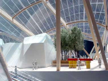
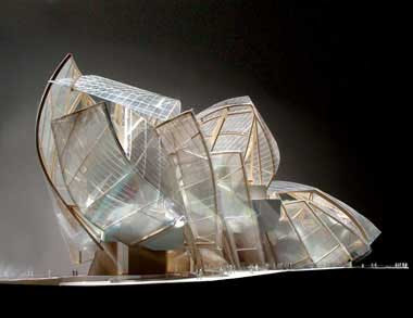
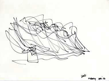
T This building is museum/social center that will have "chapels" for well known artists to hold permanent and temporary artwork. It will also be able to have an area for large meetings and gatherings. The location is near a children's theme park. The space was designed to help create "breath taking views" as it was designed out of glass which is a trademark of Vuitton. It was designed this way to incorporate the landscape with the building and not infringe upon nature but rather let the inhabitant in the space enjoy nature as an art form as well as the actual art pieces inside of it. I find this building especially inspiring as it goes along with my views on design as well as how it developed was amazing! It went from a very rough sketch on paper as shown below to a full out masterpiece that is functional but also nature oriented and place of art that is an art form in itself. Below are pictures:
 Here are other links corresponding to project:
http://www.arcspace.com/architects/gehry/vuitton/vuitton.html (article)
http://www.arcspace.com/architects/gehry/features.htm (other works by this firm)
http://www.foga.com/ (main website of firm)
http://www.arcspace.com/exhibitions/linz/linz.html (Other interesting museums)
Second Article:
Steven Holl Architects
T-Houses located in Denmark
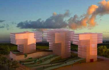
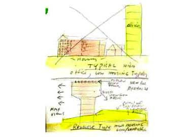
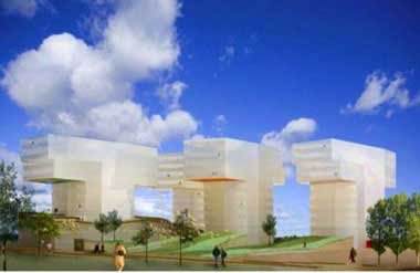
The main purpose of the T-Houses is to design apartments for individuals while incorporating the landscape. The best way to explain this house is none other than the designer whom explains the design as follows:
“We wanted to create a sense of autonomy, individuation, and particularity for each apartment and tower. One of the failures of modern housing comes from the lack of individualization. Concepts should not be based on the mass, but on individuals. We aim for an architecture that is in connection to each human being. Therefore, new typologies need to be created of which the dancing T’s are an example.” --Steven Holl
I have a great respect and interest in this project because it's based off the sunsets of the area, the green of the landscape, as well as the concept of something so monotone and impersonal as an apartment being viewed as an individual's personal space. Below are pictures of the T-Houses in concept and model:
 Further Links:
http://www.arcspace.com/architects/Steven_Holl/t_house/t_house.html (article link)
http://www.stevenholl.com/ (main firm website)
These buildings incorporate the design ideas I have currently and further reinforce them. Not only that, it further makes a statement that the buildings in an environment can and do change the feel, space, and regard of the surrounding area. Architecture can change a community.
Article 1: Gehry Partners, LLP
Foundation Louis Vuitton Located in Paris France
The structure is "A bridge between the Bois de Boulogne and the Jardin d’Acclimatation."
T This building is museum/social center that will have "chapels" for well known artists to hold permanent and temporary artwork. It will also be able to have an area for large meetings and gatherings. The location is near a children's theme park. The space was designed to help create "breath taking views" as it was designed out of glass which is a trademark of Vuitton. It was designed this way to incorporate the landscape with the building and not infringe upon nature but rather let the inhabitant in the space enjoy nature as an art form as well as the actual art pieces inside of it. I find this building especially inspiring as it goes along with my views on design as well as how it developed was amazing! It went from a very rough sketch on paper as shown below to a full out masterpiece that is functional but also nature oriented and place of art that is an art form in itself. Below are pictures:


 Here are other links corresponding to project:
http://www.arcspace.com/architects/gehry/vuitton/vuitton.html (article)
http://www.arcspace.com/architects/gehry/features.htm (other works by this firm)
http://www.foga.com/ (main website of firm)
http://www.arcspace.com/exhibitions/linz/linz.html (Other interesting museums)
Second Article:
Steven Holl Architects
T-Houses located in Denmark
The main purpose of the T-Houses is to design apartments for individuals while incorporating the landscape. The best way to explain this house is none other than the designer whom explains the design as follows:
“We wanted to create a sense of autonomy, individuation, and particularity for each apartment and tower. One of the failures of modern housing comes from the lack of individualization. Concepts should not be based on the mass, but on individuals. We aim for an architecture that is in connection to each human being. Therefore, new typologies need to be created of which the dancing T’s are an example.” --Steven Holl
I have a great respect and interest in this project because it's based off the sunsets of the area, the green of the landscape, as well as the concept of something so monotone and impersonal as an apartment being viewed as an individual's personal space. Below are pictures of the T-Houses in concept and model:


 Further Links:
http://www.arcspace.com/architects/Steven_Holl/t_house/t_house.html (article link)
http://www.stevenholl.com/ (main firm website)
These buildings incorporate the design ideas I have currently and further reinforce them. Not only that, it further makes a statement that the buildings in an environment can and do change the feel, space, and regard of the surrounding area. Architecture can change a community.
Monday, February 5, 2007
Post 10: Blog Update
Currently, I'm in the process of changing my blog's look. I have been experimenting with different backgrounds and I am going for a space theme. I'm trying to make the blog as easy to read and visually pleasing for the user while putting in my own flare. I do like the format of blogger.com but I want to expand on it further. I'm changing the texts, colors, backgrounds, adding and subtracting from the layout.
Since the last css program took a really long time and I had to go in and research extensively and practice with those tools, it is going a lot quicker this time. The hard part is trying to figure out all the different labels and testing what changes changes what but once you start to program and organize yourself it goes a lot smoother. This time around it's more of a design aspect since I have a better understanding of the program and how it works so there is more focus on design instead of how does what work. I'm not saying I'm an expert at it yet, by far, but it's not as difficult as when we started because there is that little experience. This project is going to and is already taking a lot a of time.
I have the css code and I'm saving it in an exterior file so that I can make sure it works without going in there and messing up all the original code of blogger.
Useful sites are:
http://www.w3schools.com/
http://www.cssdrive.com/index.php/main/galleryitem/blogger/
http://www.csszengarden.com/
http://www.htmlhelp.com/reference/css/
http://www.echoecho.com/css.htm
Post 10: Blog Update
Currently, I'm in the process of changing my blog's look. I have been experimenting with different background and I am going for a space theme. I'm trying to make the blog as easy to read and visually pleasing for the user while putting in my own flare. I do like the format of blogger.com but I want to expand on it further. I'm changing the texts, colors, backgrounds, adding and subtracting from the layout.
Since the last css program took a really long time and I had to go in and research extensively and practice with those tools, it is going a lot quicker this time. The hard part is trying to figure out all the different labels and testing what changes changes what but once you start to program and organize yourself it goes a lot smoother. This time around it's more of a design aspect since I have a better understanding of the program and how it works so there is more focus on design instead of how does what work. I'm not saying I'm an expert at it yet, by far, but it's not as difficult as when we started because there is that little experience. This project is going to and is already taking a lot a of time.
I have the css code and I'm saving it in an exterior file so that I can make sure it works without going in there and messing up all the original code of blogger.
Useful sites are:
http://www.w3schools.com/
http://www.cssdrive.com/index.php/main/galleryitem/blogger/
http://www.csszengarden.com/
http://www.htmlhelp.com/reference/css/
http://www.echoecho.com/css.htm
Post 9: Open Source

The great thing about open source is that for the users it gives them more power by creating a shift from the corporations to the users. The users get to re-write the program to customize it and in doing so the corporation as a trade off gets much needed feedback. Originally the program distributor would have the programmers write programs but not with the user in mind. They would write the programs to perform only certain features and with open source the user instead could change it to their liking and how it would benefit them best.
Culturally this is a phenomenon because the technology of the internet was spreading but without open source certain parts of the world were still isolated. The purchased programs were mainly being isolated to one set area instead of branching out. With open source the users spread out the program much faster by sharing and distributing the code they used. This in turn caused many competitors wanting to open source in order to keep up with the competition. The downside though as in the case of China is that with all the competitors and changes while open source and those programs would be around as they have been for many years-if they chose the wrong program to use instead of opening themselves to the world through networking they would instead be isolating further than they already were.
As far as people like you and me where we use open source programs in our everyday lives it is good for us. The competition is there to show the programs which expose us to even more programs to better customize to our lives. The only foreseeable downside to see to it are those of two: with downloading open source software it could infringe on your privacy as you often have to download other software that may or may not be spy ware but also you have to often register yourself under the website and get licenses. The other downside is that the technology is always changing and the programs that are here today will most likely be here tomorrow but could go under, become obsolete, and trying to keep up could become overwhelming. But even with those downsides, there is always an upside in that you can use several programs to write your own and essentially through open source you have the shell of a program to write your own
Sources:
http://en.wikipedia.org/wiki/Open_source
http://www.oreillynet.com/pub/a/oreilly/opensource/news/myths_1199.html
http://www.firstmonday.org/issues/issue8_10/jesiek/
http://www.computerworld.com/developmenttopics/development/story/0,10801,93109,00.html

Post 8: Open Source
Open source by definition is: "A method and philosophy for software licensing and distribution designed to encourage use and improvement of software written by volunteers by ensuring that anyone can copy the source code and modify it freely" (Howe, 1999). Essentially open source is basically sharing, downloading, and using programs to be rewritten by the user to accommodate their needs. Open source is similar to free software but isn't that by there is often a catch of having to download a bundle of software. Culturally though up until recent years it was frowned because you're not "paying" and for software companies to go open source was revolutionary. It was trying to balance the software that should be open source with the one of purchasing. Different companies began turning to open source because as the internet began to take off it was in their best interest. Many companies while they did not want to admit it used that sort of technology supposedly to have an edge over the competitor but in reality the competitor was using the same technology. When they began open source they didn't loose the money they thought they would because while it is essentially cost free to the user downloading it, the user and the group of programmers downloading the software would customize it and rewrite to the their own. In doing so, they began to find the problems, fix things themselves, and at the same time spreading the technology and program much quicker than a purchased one. Also the companies weren't loosing the money they would have made if purchased because many large corporations that used their programs ended up being donors, not to mention those companies that went open source could save money by using the competitor's open source software.
The great thing about open source is that for the users it gives them more power by creating a shift from the corporations to the users. The users get to re-write the program to customize it and in doing so the corporation as a trade off gets much needed feedback. Originally the program distributor would have the programmers write programs but not with the user in mind. They would write the programs to perform only certain features and with open source the user instead could change it to their liking and how it would benefit them best.
Culturally this is a phenomenon because the technology of the internet was spreading but without open source certain parts of the world were still isolated. The purchased programs were mainly being isolated to one set area instead of branching out. With open source the users spread out the program much faster by sharing and distributing the code they used. This in turn caused many competitors wanting to open source in order to keep up with the competition. The downside though as in the case of China is that with all the competitors and changes while open source and those programs would be around as they have been for many years-if they chose the wrong program to use instead of opening themselves to the world through networking they would instead be isolating further than they already were.
As far as people like you and me where we use open source programs in our everyday lives it is good for us. The competition is there to show the programs which expose us to even more programs to better customize to our lives. The only foreseeable downside to see to it are those of two: with downloading open source software it could infringe on your privacy as you often have to download other software that may or may not be spy ware but also you have to often register yourself under the website and get licenses. The other downside is that the technology is always changing and the programs that are here today will most likely be here tomorrow but could go under, become obsolete, and trying to keep up could become overwhelming. But even with those downsides, there is always an upside in that you can use several programs to write your own and essentially through open source you have the shell of a program to write your own
Sources:
http://en.wikipedia.org/wiki/Open_source
http://www.oreillynet.com/pub/a/oreilly/opensource/news/myths_1199.html
http://www.firstmonday.org/issues/issue8_10/jesiek/
http://www.computerworld.com/developmenttopics/development/story/0,10801,93109,00.html

Subscribe to:
Comments (Atom)


