Monday, February 12, 2007
Indesign Project
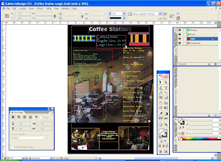
The plan for the project as of now is trying to get the basic layout of playing on the idea of it being a train station but also a computer friendly zone. I wanted to make the boxes look like dialog boxes or even pop ups with the different coffees in them. I kept the same labels because that's what the waiter knows at the bar in order to avoid retraining the employees. I want to for the final am considering though re-arranging the prices in order of most expensive to least expensive in the different categories to make it more user friendly. I also took pictures of the place to incorporate that it is a place of relaxation. The main objective in my project is to show the many aspects of the user friendly coffee place such as computer use and a place to basically hang out. I did change the text to show the different categories and I want to use it in tabloid style. The back and the front will have the same basic design principles. Below is a picture of the rough draft of the final menu:


Subscribe to:
Post Comments (Atom)
No comments:
Post a Comment