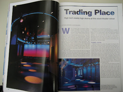
The article was taken from Architectural Lighting from the TRC located in Langford Building A at Texas A and M College Station. The articled was about how a computer company in order to gain confidence in their customers and try show the workings behind how their computers work. They used the space with different lighting effects to create to try and get across the point in an entertaining but educational way.
In regards to the layout of the article I do like how there is an interesting picture in the left hand corner that is introduced before the actual article. It peaks the interest of the viewer to read further, but it doesn't overwhelm the reader by several means. Visually, there is not a lot to read but the content is there. The borders help to define the edges and focus in on what is important. That way the viewer's eyes don't wander all over the page. The title is clean cut like the subject matter, bolded to grab attention, and incorporates the theme by having the background of the space be incorporated in the lettering. There is a smaller subtitles that do not distract but are emphasized as is their purpose. The letter cap with the "W" makes the opening sentence interesting and visually takes away just how much there is to read which isn't overwhelming. The picture on the bottom left helps to add to the design but doesn't take away from the article because the text wraps around it with an undefined line border. Visually, your eyes make a box around it to know it's not part of the text but is important to the text. You don't necessarily have to read it but since it's bolded and out of context you want to find out what the picture is about. There is also a fairly neat organization with the two columns and spacing between them and the paragraphs. The ideas are broken apart from each other and the titles are emphasized but not the point of being too distracting from the overall reading.
Finally, the colors tie together the whole work so that it is thoughtful in how it's laid out, visually pleasing, and well composed.
No comments:
Post a Comment