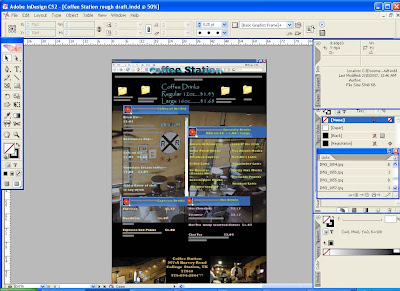
I continued the project proposal as before and expanded upon it. I changed the texts and colors to identify the different categories. I made the lists show up as different IM boxes so that the menu looks like a computer monitor screen. I like this particular idea since it emphasizes the computer friendly atmosphere of coffee zone. All the pictures I took myself at Coffee Zone excluding the one at the bottom of the cup of coffee. I will be continuing this type of style further to the other lists. The format had to change from being a tablet because of size to at least 3 pages. Any ideas or comments are more than welcome to help me further the project.
No comments:
Post a Comment